Mario
(Current scale is below 100% - zoom in to view full detail)
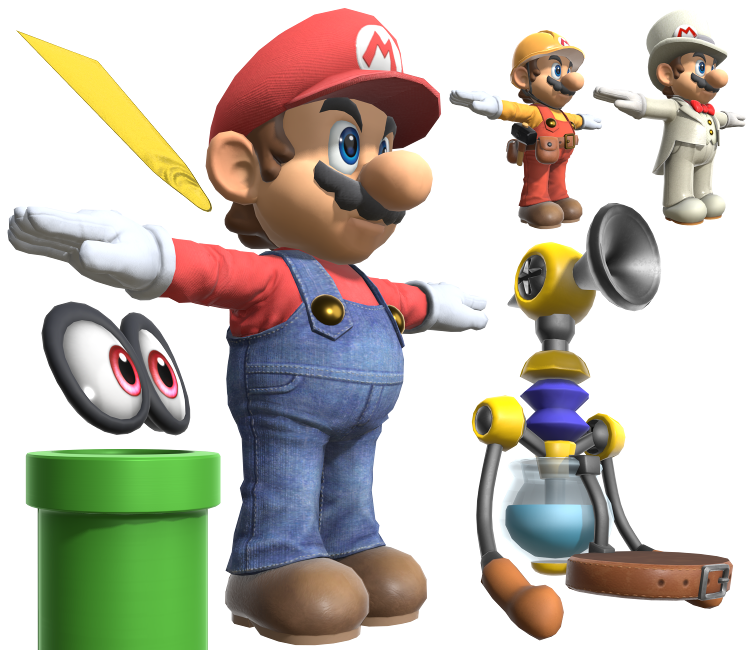
| Asset Info favorite | |
|---|---|
| Name | Mario |
| Category | Nintendo Switch |
| Game | Super Smash Bros. Ultimate |
| Section | Fighters |
| Submitted | February 20, 2019 |
| Uploaded By | Centrixe the Dodo |
| Size |
34.12 MB (147 items) arrow_right
|
| Format |
ZIP (application/zip) dae, fbx, png, txt |
| Hits | 86,135 |
| Tags (9): arrow_right | |
Comments (39)
You must be logged in to post comments.

Neither this model or Doctor Mario's model have arm/head bones. Or at least, none that I can find.

I still don't get why they made his and Luigi's brows and 'staches dark gray. I get they didn't want them to be pitch black because it'd look weird with the lighting engine, but couldn't they have gone with a really dark brown or something?
@Hans Well, Mario is pretty much designed well. The texture's seem realistic.
@Hans Smash Mario has his own design sorta, on the brink of realistic and not.
it's a whole thing
it's a whole thing

the eyes are off center and the rig is chest down only, how to fix?
@Hans Well to be fair, the more vibrant colors go against this game's aesthetic. He looks shorter and chubbier than in the previous Smash games here IMO.
Y'know, lookin' at this model of Super Mario, I realized they're using a now outdated Mario design. Because after the N64 era Mario model they redesigned and refined his design in Super Mario Sunshine and then finalized him and the rest of the cast for Mario Party 4, But then in Super Mario 3D World they slightly Tweaked his design again.
And recently they Gave Mario a brand new design revamp in Mario Kart 8 and Mario Maker, giving him kinda more tan-ish, orange-ish skin, making his skin a little less pale, made him a little shorter and chubbier, improved the lighting, and made his irises a bit more vibrant. So, yeah, it looks like they're using an older Mario design for this game.
And recently they Gave Mario a brand new design revamp in Mario Kart 8 and Mario Maker, giving him kinda more tan-ish, orange-ish skin, making his skin a little less pale, made him a little shorter and chubbier, improved the lighting, and made his irises a bit more vibrant. So, yeah, it looks like they're using an older Mario design for this game.

These new renders look much nicer and detailed! Though maybe they could be a little more colorful.

(Unrelated): You'd think there would be some kind of April fools joke on this site but we played nice this time.
This Mario model looks amazing when you look at it from this perspective

It would appear to be that way but I'm not too sure @Saetta06
is the cappy model the same as odyssey? or not

I just added the white to the texture @Random Talking Bush

@SuperMarioSmash322: You need to make a "composite" material for those. The eye whites should be applied to UV mapping layer 1, while the pupils are on either 2 or 3 (depending on the eye).

help please, when I put the textures to the model of mario the texture of the pupil does not appear
Let's-a go!
Interesting, the wedding outfit seems to be entirely ripped from Odyssey, even his shoes, gloves and textures. Maybe the textures were edited but still from there. His hands were just posed to fit the skeleton, and there's probably some edited proportions, but yeah. Cappy's eyes look like they were ripped from there too.
Too bad Mario himself changed little from Wii U (Just like Luigi and others for example), which is also not much better than in Brawl polygon-wise.
Too bad Mario himself changed little from Wii U (Just like Luigi and others for example), which is also not much better than in Brawl polygon-wise.
HD F.L.U.D.D. looks so great!
Doesn’t seem to
Be too many changes from wii u model but the texture work is fantastic
Also thanks for ripping the accessories too
Be too many changes from wii u model but the texture work is fantastic
Also thanks for ripping the accessories too
| keyboard_double_arrow_left keyboard_arrow_left | Page 2 of 2 | keyboard_arrow_right keyboard_double_arrow_right |