Crash Bandicoot
(Current scale is below 100% - zoom in to view full detail)
| Asset Info favorite | |
|---|---|
| Name | Crash Bandicoot |
| Category | PlayStation 4 |
| Game | Skylanders: Imaginators |
| Section | Skylanders (Imaginators) |
| Submitted | June 29, 2025 |
| Uploaded By | Aquaileron |
| Size |
16.47 MB (66 items) arrow_right
|
| Format |
ZIP (application/zip) dae, png |
| Hits | 3,117 |
| Tags (5): | |
Comments (15)
You must be logged in to post comments.

Reply to comment by Ninetails2000 posted Apr 23, 2026 10:32 PM
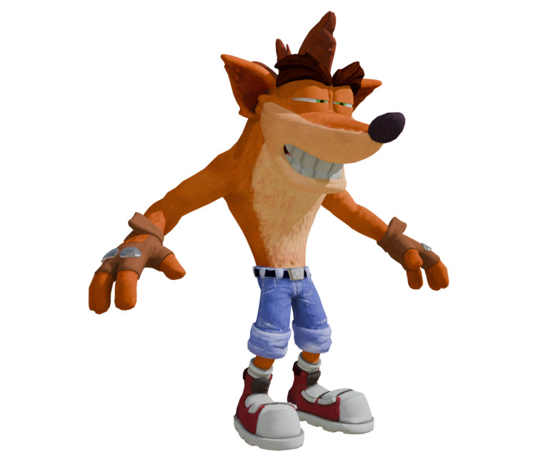
A very fine assessment of the Skylanders design if I do say so myself. He manages to capture the wacky, zany spirit that Crash is known for while staying true to Charles Zembillias' original concept art of him. The only part of this design I'd say is rather iffy are the brass knuckles on the gloves, which just look out of place, but to me, everything else about the model is spot-on to Mr. Zembillias' artwork without removing the core essence of what makes Crash so lovable and goofy.

This mirrors a lot of my thought on Crash 4. Both he and Coco feel way too Dreamworks-ified. Very smoothed out and clean. The NST/CTR models do a decent job of emulating the Classic style but lacked a lot of that wacky, zany sauce that Crash had up to that point. The Skylanders model, to me, is the best modern design because it provides a modern twist on Crash that still keeps a lot of the sauce.
He's a chunky, no-neck bastard wearing clothes with visible wear, tear and reinforcement to sell the idea that he kicks ass and has fun. He's scruffy and kinda crusty and his face is perfect for all those aside-glances and wild-takes that Crash is known for. It's not the same as the classics, but it adapts a lot of the spirit they had, you know?
He's a chunky, no-neck bastard wearing clothes with visible wear, tear and reinforcement to sell the idea that he kicks ass and has fun. He's scruffy and kinda crusty and his face is perfect for all those aside-glances and wild-takes that Crash is known for. It's not the same as the classics, but it adapts a lot of the spirit they had, you know?
me personally i am not really a fan of crash 4 crash, he just kinda looks too tame imo, like the original crash, along with most of the redesigns afterwords have a sorta wackiness to them that the the crash 4 design is missing, i think it's mainly in the face? idk if i am describing it the best
I see what you're getting at. While I do concur that the Crash 4 design is easily the most visually appealing, the NST design is by far the most accurate to the original Naughty Dog-era renders of him in terms of proportions and whatnot. But I suppose all 3 designs have their ups and downs that make them unique and distinct from each other.

I just have to say personally that the NST trilogy design isn't too appealing. Especially with that weird lip thing they had going on instead of lighter fur around the mouth. Though the fur and textures on the NST look quite nice, I think the Crash 4 design is easily the best of the era, it's got strong and appealing shape design, it might not look the most realistic but I think Crash is always bound to work better in cartoony styles.
Alright, fair enough.
i'm personally not into a lot of n. sane era stuff design wise in general, i'm not into the more realistic style they decided to go for. also mixed on crash 4's direction, there's some designs i like from that game but others i really don't fuck with
Huge disagree with all of these. The NST design blows this one and especially the Crash 4 designs out of the water.
Personally I'm a huge fan of the Crash 4 design, though I prefer this design way over the NST design
Agree. This design highkey fucks and IMO is a better modern day take on Crash than his NST or Crash 4 designs.
his best post hiatus design imo, really wish they kept this guy
@Mjtheflareon And this model ends up as a placeholder model for N. Sane Trilogy with some differences in said model.
Never knew Crash Bannoca was in skalanders

WHOA!

CASH BANNOCA!